Poster or Handbill: Choosing a Format for the Invitation
Poster or handbill: choose the format that fits where people will encounter your event, so its essential details are visible, useful, and easy to share.
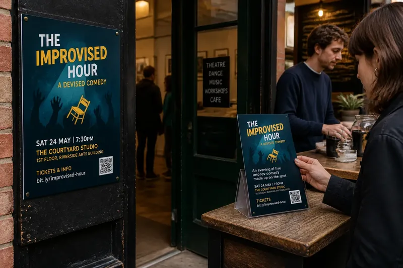
A poster or handbill succeeds when its form suits the moment someone encounters the invitation. A poster catches the eye at a distance; a handbill can travel in a pocket, sit beside a ticket desk, or pass from one person to another. For a show organizer, the choice is less about which looks more impressive and more about what a viewer can do next.
Let the encounter decide the format
Start with the place where the invitation will appear. A poster belongs where people pause or pass repeatedly: a theater lobby, café noticeboard, library window, community arts center, or the entrance to a rehearsal venue. Its job is to make a brief encounter memorable enough for someone to stop, read, or look up the event later.
A handbill works well where a person can accept something directly. It can be offered after a matinee, placed on a counter, included with a program, or left at a record shop that welcomes local performance notices. The exchange gives the audience a closer look than a glance across a room, but only if the handbill is welcome in that setting.
Notice the conditions, not just the venue name. A poster behind reflective glass may be hard to read; a handbill on a crowded table may disappear beneath other papers. Ask whether people will approach, whether they can take a copy, and whether the material will remain visible for the event’s run.
Give each format a different job
A poster is a public marker. It should identify the show and make its invitation legible from the distance and angle available. Its strongest information is usually the event name, the kind of experience being offered, the venue, and a clear route to further details.
A handbill is a portable prompt. It can carry a little more context because a reader can hold it and turn it over, though extra space is not a reason to fill every corner. A concise description, date and time, venue address, ticket or reservation information, and a web address or QR code can help someone decide and act without searching for a second source.
Keep the two pieces related without making them identical. Use the same title treatment, color family, or image so the invitation is recognizable across settings, then adjust the amount of information to the format. A poster may direct viewers to a short URL; a handbill can explain what they will see and how to attend.
Design for the distance and the hand
For a poster, test the hierarchy from the place it will hang. Stand back from a printout or view the design at a reduced size on screen. The event title should register first, while the date and venue should remain easy to locate. If a dramatic image competes with the title, the image may be doing more work than the invitation requires.
For a handbill, check readability at ordinary reading distance and in the lighting where it will be distributed. Small type can make an address, access note, or booking detail effectively invisible. Leave enough open space around the main information, and avoid relying on a color distinction that may be difficult to see in grayscale or under dim indoor light.
Paper choice should follow the conditions. A handbill intended for a lobby table needs to feel easy to pick up and carry; a poster needs enough stability to stay presentable on its board or window. Check the venue’s rules and the printer’s paper options before committing to a finish that could glare, curl, or be difficult to display.
Make the invitation complete without overloading it
Before printing, confirm that the essential details agree everywhere the audience may look. Event title, date, start time, venue name, address, booking route, and any age or access information should match the event’s official listing. A beautiful design cannot compensate for a missing location or a link that leads to an unrelated page.
Decide which details are genuinely needed on the physical piece. If the show has a short description that helps people understand its form, include it on a handbill or in a compact line on the poster. If the details are likely to change, make the printed invitation point to a page that can be updated, rather than squeezing uncertain information into permanent ink.
Imagine a neighborhood theater presenting a devised comedy in a shared arts building. The organizer places a poster by the building entrance, where visitors can read the title, date, and room location, and offers handbills at the café counter with a brief description and booking link. Someone who only passes the entrance can remember the event; someone already inside can take the fuller invitation away.
Choose a distribution plan before choosing a print run
Count the actual places and opportunities for distribution, not an imagined audience. A small set of permission-based poster locations may serve a local event better than a large stack that no one has agreed to display. Likewise, handbills are useful only where people can receive them or take them without being pressured.
- List the specific venues that have agreed to display a poster.
- Identify counters, ticket desks, or partner spaces where handbills are welcome.
- Ask who will place the material and whether they will need a replacement.
- Choose a distribution point that is close to the event’s likely audience and easy to reach.
- Keep a small reserve for a venue that requests more, rather than leaving bundles unattended.
These checks make the format decision practical. If the event has one reliable lobby and no organized hand-to-hand distribution, prioritize a poster. If a partner group can share handbills directly with interested people, a portable piece may do more useful work. Many small productions use both, but each should have a distinct placement and purpose.
What should each format tell a passerby?
What belongs on a show poster?
Give the poster the show title, the event’s basic identity, and the details a viewer needs to recognize where and when it happens. Add a simple route to more information, such as a readable short web address or QR code, and make sure the code has a printed alternative.
What belongs on a handbill?
Include the practical attendance details and a short description that helps someone decide whether the event interests them. A booking method, venue address, and relevant access information are more useful than a long block of promotional language.
Can one design work for both formats?
A shared visual identity can work, but the layout should be adapted to the physical use. Enlarge the title and simplify supporting copy for the poster; use the handbill’s closer reading distance for fuller details without shrinking the type.
Should a QR code replace printed details?
No. A code can lead to current information, but a person should still be able to identify the event and its basic timing without a phone. Print a short URL or another clear contact route as a fallback, and check that the destination is correct before distribution.
Review the invitation as an audience member
Read each piece in the conditions it will face. For the poster, stand where a visitor would first see it and ask what registers before they walk past. For the handbill, hold it as someone would while leaving a venue and check whether the next action is obvious.
Ask a colleague who did not make the design to find the date, venue, and booking route. This is not a formal test of the audience; it is a quick way to catch a detail that has become invisible through familiarity. Correct the file before printing rather than relying on a handwritten fix or verbal explanation.
Poster or handbill is not a contest between a larger statement and a smaller one. The poster makes a show present in a place; the handbill carries the invitation beyond that place. Choose according to how people will encounter the event, and make every printed detail point toward a clear, welcoming next action.